
Why Jaguar's 'colourful' makeover falls flat
A hair-raising new ad leaves us wondering what on earth just happened

Oh dear. The internet does not seem very happy with a recent leap made by British car maker Jaguar. It all started with a one-minute video ad that’s led to the wheels falling off (and that’s the last pun I’ll make, I promise).
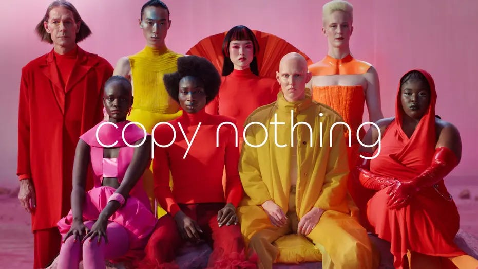
What went wrong. A lot of things. The ad announcing the rebrand seems wildly… disconnected. It shows a group of models dressed in bright clothing emerging from and posing in front of brightly coloured rooms and backdrops. Oh and this is happening on a planet that could only exist in Nicki Minaj’s imagination.
“Live Vivid” and “Delete Ordinary” flash on screen before revealing the slogan “Copy Nothing”. It’s a bold statement to make when you’re watching something you’ve seen pretty regular fashion brands do over and over again.
Did I mention the ad doesn’t show any cars? Plenty of lumo jackets and razor sharp bobs (“Claire, it’s French!”) but not a single car in sight.

Why did they do it? A press release issued by Jaguar Land Rover’s chief creative officer, Gerry McGovern, states that the rebrand “recaptures the essence of Jaguar, returning it to the values that once made it so loved, but making it relevant for a contemporary audience.” That relevance seems to be referring to their big plans to enter the EV market and one has to assume attract a younger market. The aesthetic is certainly electric.
But have they excluded their core base of loyal fans by overcorrecting? Let’s have a look.
Who is saying what? If the brand was looking to evoke a feeling, they certainly achieved that – albeit the wrong one. Car enthusiasts on X and motoring journos alike weren’t shy to criticise the advert. My personal favourites are below.


What happens next? As of writing this, I couldn’t find a further statement from Jaguar after their rebrand announcement. I’ll be eagerly refreshing my feeds to see how they come back from what inc.com is calling a great example of “what not to do”.
For me the saddest part is saying goodbye to the gorgeous wild jaguar emblem, pouncing from the bonnet. Instead we have something called the new “leaper” logo. Which, to be frank, could be mistaken for belonging on a sleeve of Nespresso.
What do you think? Feel free to comment on the overhaul, the (sigh) new font, and what you think Jaguar is up to.